Chains Of Fate
Senshi in Training
 Requires vast amounts of energy
Posts: 29
|
Post by Chains Of Fate on Nov 6, 2007 15:59:42 GMT -5
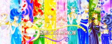
Hello all! ^^ What I'm requesting is to have the Pretty Guardian Sailor Moon logo made to say "Pretty Soldier Sailor Moon The RPG" instead, and only in English. To save some trouble, here's the best quality version I could find:  "Pretty Soldier" would be centered (about where the kanji is below "Pretty Guardian") "Sailor Moon" (two words, not one) should be in the same place "The RPG" should be where the kanji is below "Sailormoon" is on the PGSM logo. The text and things don't have to be exactly right on, and it would probably have to be made from scratch. If you'd like to add other details, that's fine too. ^^ This will be used for promotional art and for the title screen of the game and things, so I need a version where the background is transparent. It would be a great help to me if someone could do this, thank you all for your time. ^^ To check out the project, go to www.pssm-rpg.com |
|
|
|
Post by v-chan on Nov 7, 2007 14:41:36 GMT -5
I'll take it on. ^^ If anyone else wants to give it a shot as well, feel free. But yeah, I'll give it a try. EDIT: Ok, here goes. I've got 2 for you, one obviously more....decadent....than the other. If neither suits your taste....I guess I'll do what I can to fix it, if you wish. Here goes. 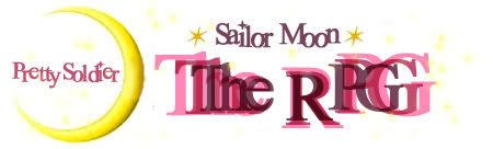  hope you like them. Or at least, one of them. ;D |
|
Chains Of Fate
Senshi in Training
Requires vast amounts of energy
Posts: 29
|
Post by Chains Of Fate on Nov 7, 2007 22:51:08 GMT -5
Ah, thank you so much for stepping up to help! ^__^ I like the first one best, a more simplistic style is what I'm looking for for the main logo. The only thing I don't like are the fonts and how they're written. So no slanted letters, they should be straight. And "The RPG" should just be written in big letters. If you use Photoshop, try experimenting with some cool textures and things. If you need help finding more fonts, this site has a bunch of great ones: ^^ www.1001freefonts.com/I like the Freebooter font here myself: www.1001freefonts.com/calligraphy-fonts.htmSorry to be so picky. ^^; I'm a perfectionist so hopefully you don't think I'm being too anal. XD Thank you again for stepping up to help! |
|
|
|
Post by v-chan on Nov 8, 2007 7:41:08 GMT -5
haha, no worries. I'm a perfectionist myself, I just saw so many different possibilities for how this could go...I'll work on it again tonight (hehe, I just got to school.....no photoshop. ^^) And I 'm glad to know I've got your permission to use textures, I was a little afraid to...like I said, this type of things could go so many ways, and I wasn't sure what would be considered overwhelming, and what wouldn't be....^^ YAY!
|
|
|
|
Post by v-chan on Nov 12, 2007 10:08:33 GMT -5
 here's what I've got; if this is what you want, I'll go ahead and make it transparent, etc. Just let me know! quick credit: texture @ aethereality.net |
|
Chains Of Fate
Senshi in Training
Requires vast amounts of energy
Posts: 29
|
Post by Chains Of Fate on Nov 14, 2007 22:12:43 GMT -5
Hi! At the last moment, someone on the Genvid forums made this:  I can't believe they got the text so close. >.> Sorry I made you do that work. ^^; But thank you so much for your help! |
|
|
|
Post by v-chan on Nov 15, 2007 16:51:02 GMT -5
any time. ^^ That is a really good logo; I'm sorry it just took me so long to get mine done...><;
|
|