|
|
Post by Rissachu on Mar 10, 2008 20:51:37 GMT -5
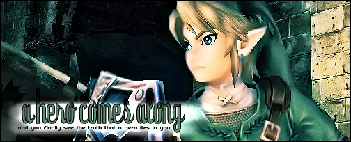
I pretty much did this entire layout in MS Paint except for the gradient in the background, that was GIMP.. Constructive criticism, please? Keep in mind that the only graphics program I have is GIMP and trust me, it's no PSP or Photoshop. www.freewebs.com/shattered-kingdom/ |
|
|
|
Post by numbmelody on Mar 11, 2008 0:30:18 GMT -5
It looks quite nice. The colors are easy on the eyes, and it's very neat, clean and easy to navigate. The only thing I have a bit of trouble with is the welcome paragraph because the pixel font is so small it's hard to read.
|
|
|
|
Post by AmyAnn on Mar 12, 2008 17:47:30 GMT -5
I agree with everything numbmelody said. Try to make the text alot more readable. However, the layout does look very nice and not to vibrant like alot of the layouts I've seen around the web. Good job.
|
|
Lemonachi
Dream Mirror
 Where did everyone go?!
Posts: 6,260
|
Post by Lemonachi on Mar 12, 2008 20:39:08 GMT -5
Nice job. I really like how you positioned the characters on the layout and the color scheme. I think I have that pixel font ;D haha but I don't think it's really suitable for a "Welcome" announcement. There are some slightly larger/wider pixel fonts from the same family-ish of 04_3b?
|
|
|
|
Post by Rissachu on Mar 12, 2008 21:27:05 GMT -5
Wow, I didn't realize so many people would have a hard time reading that font. I will definitely keep that in mind for my next layout!
|
|
|
|
Post by smsweetie on Aug 11, 2008 13:56:00 GMT -5
wow it looks really good!
|
|
|
|
Post by Ellethwen on Aug 13, 2008 23:16:53 GMT -5
Hey there smsweetie, please don't bring up very old topics. :3
|
|